R: barplotでヒストグラムをえがく [統計]
こういうグラフをえがく。
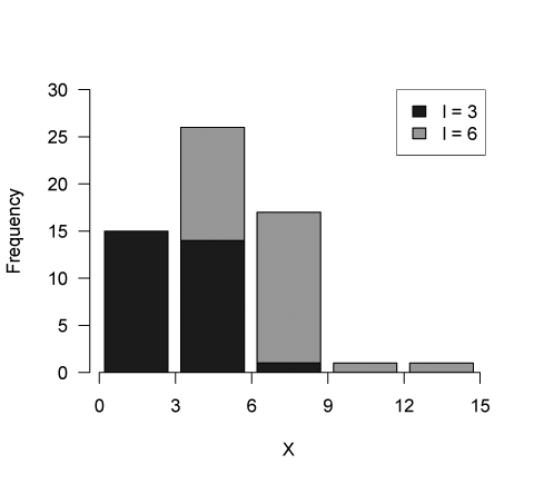
コード
set.seed(1234)
n <- 30
x <- vector("list", 2)

x[[1]] <- rpois(n, 3)
x[[2]] <- rpois(n, 6)

axmax <- (max(sapply(x, max)) %/% 3 + 1 ) * 3
breaks <- seq(0, axmax, 3)
color <- c(gray(0.2), gray(0.7))

h <- sapply(x, function(x)
                   hist(x, right = FALSE,
                        breaks = breaks, plot = FALSE)$count)
aymax <- (max(margin.table(h, 1)) %/% 5 + 1) * 5

barplot(t(h), width = 0.835, las = 1, col = color,
        ylim = c(0, aymax),
        xlab = "X", ylab = "Frequency")
axis(1, at = (0:(length(breaks) - 1)) + 0.1, labels = breaks)
legend(4, aymax, legend = c("l = 3", "l = 6"), fill = color)
タグ:R


コメント 0